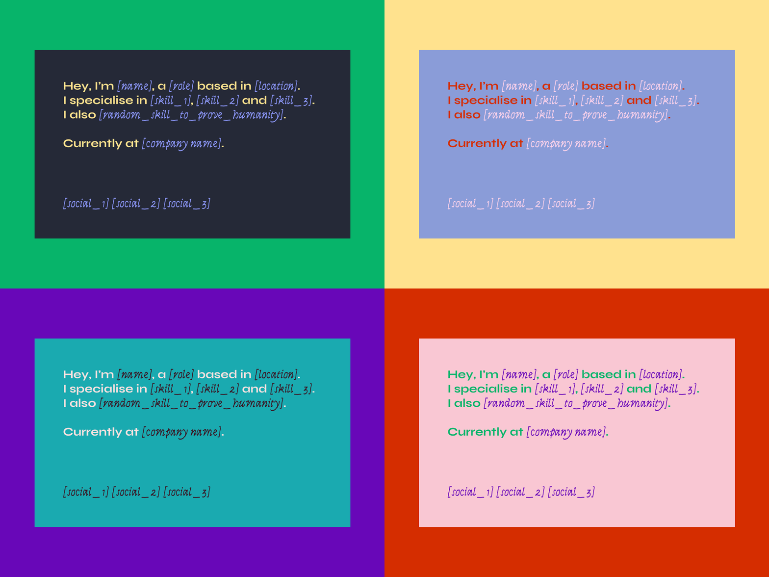
Portfolio Recipe
Have you seen this before?
I did. My portfolio is designed in a similar way actually.
Now I'm on the quest to understand the portrait of the digital [job_title]:
Why are we choosing this layout? Who are the people that use this template the most? How much space we have left for creativity when we already have a template? What is the first word used in such presentations? What are the most common humanity_proving traits?
Typeface: Syne Bold and Italic, a type family beautifully designed with contrast in mind – wide letters and an Italic that seems written by a computer in its early cursive typography classes.
Colours inspired by Dropbox colour palette and Sublime editor skins, with Josef Albers' "Interaction of colour" in mind and a pinch of my colour intuition sprinkled here and there.
[digital_anthropology]
