Elegant Mommy Logo
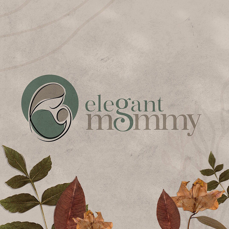
When we were working on the rebrand for Elegant Mommy, we wanted to keep the logo mark similar to the original so it wasn't too far off and made the reveal a little smoother with the transition.
For the logo mark I worked to make a few things prominent. A mother embracing her baby, her arm representing a baby carrier, the baby's face and mother's face to be different colors to represent inclusion and balance, and a halo to signify their values since they are a faith based business.
For the word mark, I worked the 'g' into both words elegant and mommy so it showed a representation of a pregnant mom looking down on her growing belly and so it kept that embrace between the two words.
