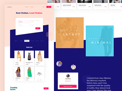
Carryon Rental Clothing
In the previous iteration, I was trying to play around with a fun look, but it didn't turn out as good as I was expecting.
So, in this iteration, I'm trying a simpler and minimal look with solid colors, and bigger typography. To make the page more interesting, I'm using tilt shapes in some sections.
Let me know what you think.
Also, In case you haven't checked already. My portfolio is out.
www.zulalahmad.com
More by Zulal Ahmad View profile
Like

