Riptide Branding and Redesign
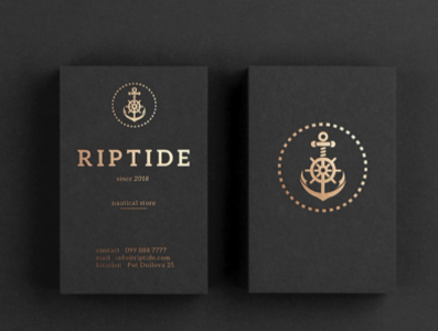


The project for Riptide was a complex one. How to create a branding around nautical equipment but also keep it minimal and different. The anchor is a universal symbol so we thought of ways to make it original. Upon client wishes we changed sketches to full designs and created a few concepts. The end result is visible and distinct at small scale but also functions as a big logo. It can be printed on different surfaces and also combines three symbols into one (because of the wide range of equipment they are selling). We also researched old nautical logos because we wanted to keep the tradition and the soul in the final result.
More work at https://www.instagram.com/josip.pericc/
More about the logo:
https://jperic.com/portfolio-riptide.html
logo.png
300 KB