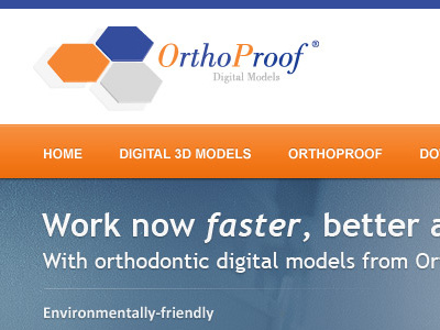
(Rebound) Header - Feed back please
I think its a huge improvement - koodos on the fantastic aesthetic.
Perhaps you could tighten the logo/contact area some, and I think that the graduating transparency of the photo is probably detracting from the call to action - your eyes go to the doctors, not the two buttons.
More by Jesse Wallace View profile
Like

