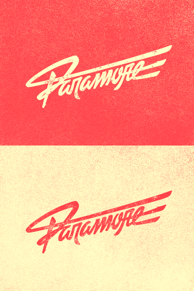
Paramore
Here's a lettering logo I've made for another college work. The proposal was to kick Helvetica out of something, so I decided to repage the Brand New Eyes album cover, which I really like (both album and cover). Like if you like it!
More by Pedro Veneziano View profile
Like
