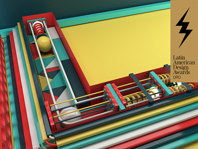
Letter L PlayFont
PLAYFONT is a personal project, gold winner in the typography category at the LAD AWARDS 2018, inspired by those free urban parks for children that existed in Venezuela when I was growing up, but are no longer available. Some of them were located at the end of a block of buildings or houses and others were behind certain condominiums or urbanisations.
The palette of colours recalls that kind of vintage melancholy that was typical at the time. The materials used were built from basic and simple geometric elements. Each letter emulates a play station, with its own character and personality, housing different kind of games dictated by the dynamic of the same letter when it was being built.
In its totality, all letters of the alphabet stand in harmony like they were a large park, like you were collecting in your memory the best public parks. A kind of abstraction and surrealism supported by the same 3D tool that allows you to believe that something unreal can exist.
I conclude with the numbers, like they were a kind of transformer game that you can construct. Let´s imagine that you are provided with a delimitated space, with the same elements, and the challenge would be to build the numbers from 0 to 9.
How would you do it?
