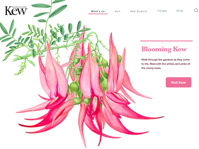
Kew Gardens landing page - Spring
For the Landing Page challenge from DailyUI, I decided to revisit the landing page for Kew Gardens in London.
Even though Kew Gardens is a London attraction, and you can see families and tourist, during my visits I have observed that one of the main groups wandering the gardens are in an older age group, especially during the weekdays.
When designing the landing page, I moved away from something too modern, as it would not resonate with that older audience, but I still wanted to make it look current.
Being a historic Royal institution, Kew Gardens has a myriad of resources available, including a botanical illustrator in residence, Christabel King. I decided to use her work, as I believed these type of illustrations would resonate with both an older and a younger audience, and highlight some of the attributes of Kew: a mixture or traditional and modern, nature and art, joyfulness and mystery.
I have experienced the garden through different seasons and I have witnessed how much it changes, so I came up with different landing pages based on the season. You can see them all in my profile.
