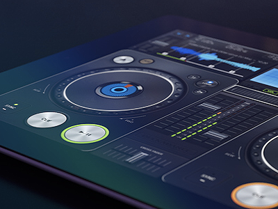
Deckadance
First it was just the iPad app, which makes sense since an iPad has a display big enough for the purpose of the application. But on later stage client required the iPhone version to be designed as well. It was a challenge. We could not just scale the UI down, we had to rework it, so the user experience would not be ruined.
See the full story on Behance! http://bit.ly/QBVtla
More by Artua View profile
Like

