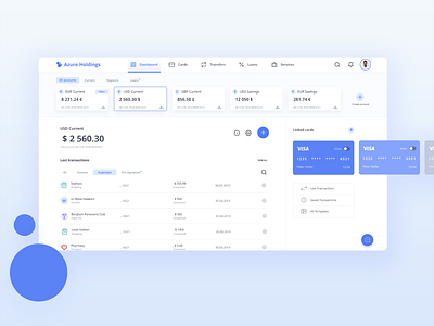
Banking app concept
The main goal was to create simple horizontal navigation and avoid vertical sidebars. In the result, it has clear information hierarchy and also saves a lot of space for a content section.
More by Anastasiia Aleksieieva View profile
Like
