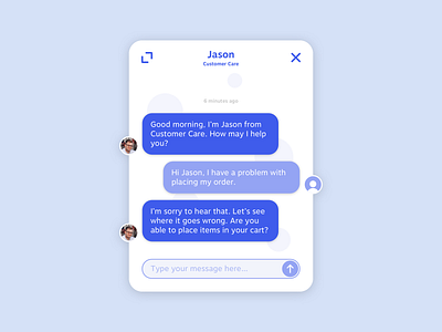
Customer Chat Interface
Hey hello Dribbblers!
Friday again. Time is flying.
Sometimes we all need a little support. And the best support is well designed support. Although customer support chats are not really special and all, some of them are just plain boring. This is an chat interface for customer support for a project that I’m currently working on, and is meant to be an overlay in the corner of the site. My goal was to make it businesslike, but also to do things a little different. I also aimed for it to be clean and show only the absolute necessary information.
What do you think about the interface? Are the color combinations working? Do you think the meaning of the icons are clear to everyone? And what about those avatars? Let me know what could be improved. I’d really appreciate your feedback.
Thanks and have a great weekend!
