New Student Email Newsletter
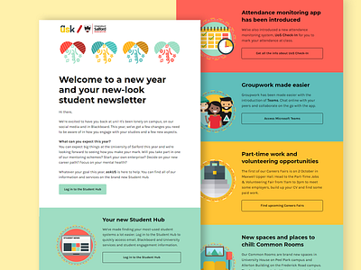
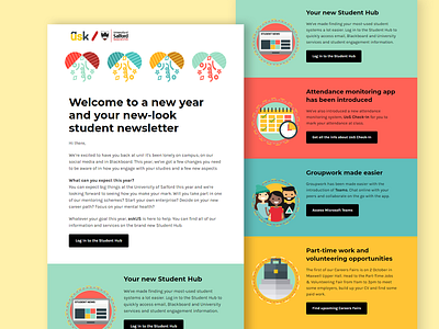
Just a revision of the newsletter, the black boxes were very constrasting and felt displaced and out of place. I decided to make them into the fill of the same box, add a black border so students know it is related to the sub headings