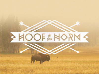
Hoof & the Horn
I'm currently spending the weekend on my farm in Kentucky to get the vibes flowing on this branding project. It's a logo for a new clothing store in Yucca Valley, CA. I definitely need to change the arrows (thanks to Jesse Strother for pointing out that they're wack.) Any other critique will be greatly appreciated. Does "& the" look weird?
More by Charlie Wagers View profile
Like
