TheFreelancer
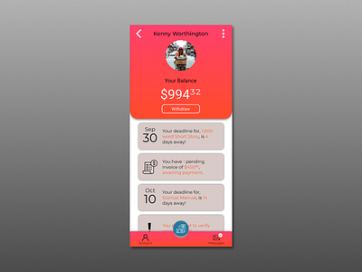
Something said to me, use bright colors as a way to catch the eye.
I also included a FAB to get the user's main task right in plain view in order for them to jump on their freelance project without having to go though multiple screens.
More by Eric Gutierrez Jr. View profile
Like
