Rame logo
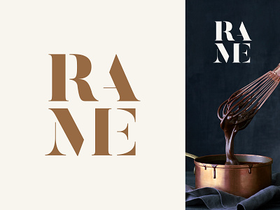
We are in the process of branding a new Italian food distributor in the UK called Rame. Rame [rah•may] is Italian for copper and the client wanted this to feature in the branding, since copper is synonymous with high quality and rustic cooking. The decision to stack the lettering came from a need to separate the syllables in the name due to the English-speaking audience immediately reading it as Rame [reim].
----
