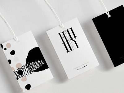
HII YII (TM) - Logo Design
I was approached to design a logo for a start up clothing company located in Australia. This logo needed to be trademarked and have the flexibility to be placed on labels, clothing, tags and other various promoting pieces.
The final and approved concept that the client picked for the logo design originated from a sophisticated approach. This is a black and white overall look that doesn’t have a separate color pallet accompanying it, as did the first two logo concepts. This would allow the material to speak for the color pallet as it changes throughout the seasons. The logo, has also taken a stacked approach instead of the one line approach like the other previous version and logo options had. This creates a front the back and up and down, legibility to the name, so, no matter how you read it, it still says “H||Y||”. The logo mark took a more simplistic approach; the logomark would serve as an option for smaller application areas.
The mocks I created for the client can be seen here, so the vision could be seen on various pieces like a tank top, store front sign, labels and also a small concept for business cards.
