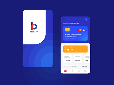
RBL Mobile App Redesign
Hey Dribbblers,
Recently I worked on mobile bank application redesigning and wanted to share it with you.
I was using the RBL bank Credit card and App created by them. But I faced many issues while using it, No good UI, hard to understand main sections, no good use of colors, bad user experience etc.
So I thought to change the UI & fill the holes by some common but useful UX strategies.I have changed the hierarchy of the main sections, used some branding colors to beautify, that’s it!
Hope you like it.
If yes! Then show some love :)
Also Join me on Instagram.
Have a artistic day!
More by Rohit Shimpi View profile
Like
