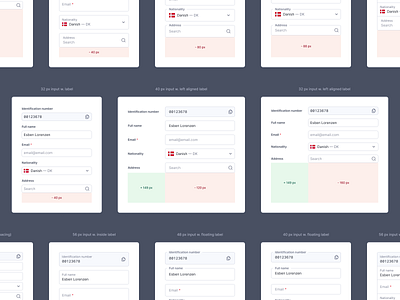
Form layout/spacing
Click the attachment for a full view of all versions (there's 11 👀)
—
When designing within healthcare, one thing you need to consider is the enormous amount of data/features always being displayed throughout the product.
Doctors spend a majority of their day reading, writing and editing patient data and therefore it is essential to have forms that are readable at a glance, easy to interact with and take up as little space as possible.
Therefore I have been exploring different styles of input fields/spacing to see how much overall space can be saved without sacrificing usability.
Even if you only save 40px by making some minor adjustments, it is 40px in every single page/flow the doctors go through every day. That adds up to a ton if they have to scroll through your product for every patient.
This is some early exploration, and I have not yet landed on the best solution, so would be very happy to hear your thoughts/feedback/experience with something like this.
Afterward, I will be looking at styling and states of the forms.


