Products and Search Screen
Hello Dribbblers 🏀
Lists are highly functional. When not using UX jargons, lists just work. It’s simple and gets the message across, and does its job. We made the list view for higher accessibility and keeping in mind what we would love to see when scrolling through thousands of glasses, first.
The Product Detail page is very clear and concise. We didn’t move away from the carousel but welcomed it. Sticking with global design patterns is very important in certain places, rather than reinventing the wheel. More information about the frames is available through the screen with additional shipping information. Various folds are thought through to meet both, the customer, and business needs.
And last but not least,
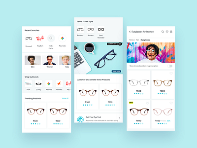
We Create an amazing experience with search flow, So user can search the products with all possible ways like Brand, Trending, Season and all.
Thanks for watching and hope you liked it!
We are available for new projects.
Just drop us a line hello@brucira.com
And yeah don't forget to Follow us 😉
Stay in touch 👇