#HereWeNeed Landing Page - Daily UI #003
Daily UI #003 - Landing Page
#HereWeNeed [brutalist style + donation usability + web]
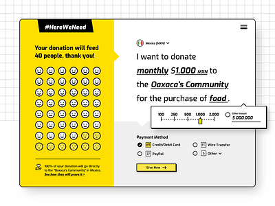
Continuing with the topic and project, I designed a landing page focused in the donation usability.
I took as reference some articles like "Donation Usability: Increasing Online Giving to Non-Profits and Charities" from NN/g https://www.nngroup.com/articles/donation-usability/ and "Six Ways to Improve User Experience" https://trust.guidestar.org/donation-usability-6-ways-to-improve-user-experience-infographic
Some important aspects to consider is be clearly about what we are giving and which impact it will have. At the time we are completing the donation sentence, we can see the faces becoming happy and the message above reflecting the impact. I think this can give value to the user and the clarity about how their money will help people and the possibility of impact directly to the local non-profit or causes.
Comments are welcome!
