Dear Gin Branding
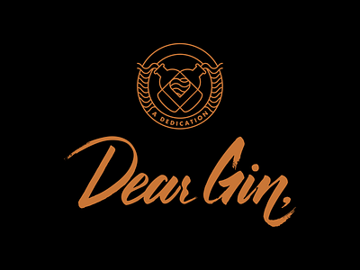
The guys from Dear Gin asked me to come up with a handwritten font that embodied the very personal "love letter" that they wanted to write with their product. At the same time, they needed a more "modern" graphic/icon to support their emotional message - a dedication.
From that, we built up the whole package design.
It was fun putting together all of their ideas, deassemble and reassemble what would and would not work together.
If you're interested in the result and the final package design, feel free to ask me about it.
Comments and critique are more than welcome.