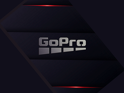
GoPro rebranding
Probably it's a time for a new logo for GoPro company. The four squares of the old logo was changed for a dynamic motion in perspective, logo is in monochrome, and the last 'O' has a subtle GoPro with a hand grip in negative space.
Thanks all for comments and appreciation!
More by vali21 View profile
Like
