Logo Study for Mindful MSP
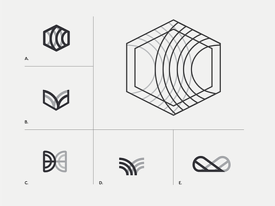
A logo I have been working on an msp client this summer. I spent a lot of time thinking about a shape that could represent their company as being "mindful" to go along with the title. They originally had a brain as the logo, but I wanted to go with something that was more technical / representative of the information that was being protected. I wanted to play with the idea of a brain being two halves of a whole, coming together to form a symmetrical shape. The final mark, A. was a more technical representation of a brain, with two curves going inward, meeting in the middle. More about this and color options in upcoming posts!
