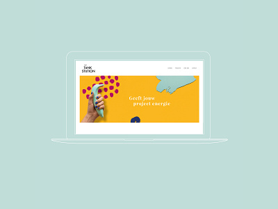
Concept image Het Tankstation
IMAGE ~ Janneke from Het Tankstation wanted to expand her website with beautiful images, where the website was still very graphic. I was given the free hand to translate the character of her company into appropriate concept images.
The corporate identity colors are central which makes it attract attention and splash the energy off. Use of surprising objects and materials and a touch of humor ensure originality and distinctive images.
I cut the organic forms from the branding that represent the inexhaustible ideas and innovative solutions from paper. Janneke's hand was used to give it a personal touch with matching nail polish. Special objects that were given their own color, painted by Janneke herself. And the photography by Nadine Klifman.
A super cool project that gave me a lot of energy!
