Homework App (V.2)
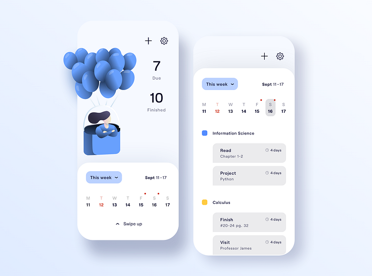
🤔 Same App, different illustration (check previous post). It’s interesting how the ‘tone of a color’ could do so much. 🧩 While my previous design uses a strong cobalt blue (the background), this version mostly uses soft, toned-down blues. 🖊 They convey a different feel. Although it is the same color blue, this one to me brings in feeling of trust and credibility. It also carries more sense of wisdom and intelligence. 🤔 What do you guys think? Check out the wireframes in the Wireframes Highlight.