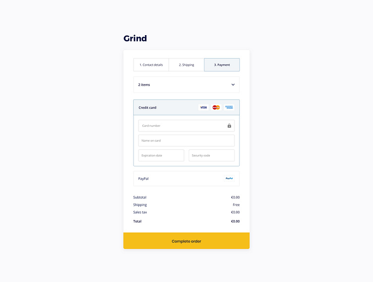
Focused checkout
I've noted that checkout tends to have numerous distractions resulting in bit of drop-off. To solve that I created a focused card-like UI with simple layout. Part of my e-commerce design system.
More by Kasper Jelaiskis View profile
Like
