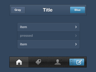
Tumblr for iPhone 3.1
Today's build went out with an entirely new skin. Most won't notice what exactly is different about it (present company excluded of course), it will just feel a lot smoother and refined.
I started out just wanting to better match the colors of the site. With the first release, I used the same hex codes for most things. That was a mistake. This time around I spent a lot of time staring at my phone and visually matching it to the site. From there, I saw a lot of ways to tighten it up. Smaller corner radii, depressed highlight states, more constistent type treatment, and less contrast overall.
Shown here at 1X, but it really needs to be seen on your Retina phone.
Lots of new features, too. That bolt in the tab bar lights up when there are new notifications, and you can now track tags in the app. We also added a sign up process, which is huge for us. It's really slick.
And the app is a bunch faster, which I can't really show here!

