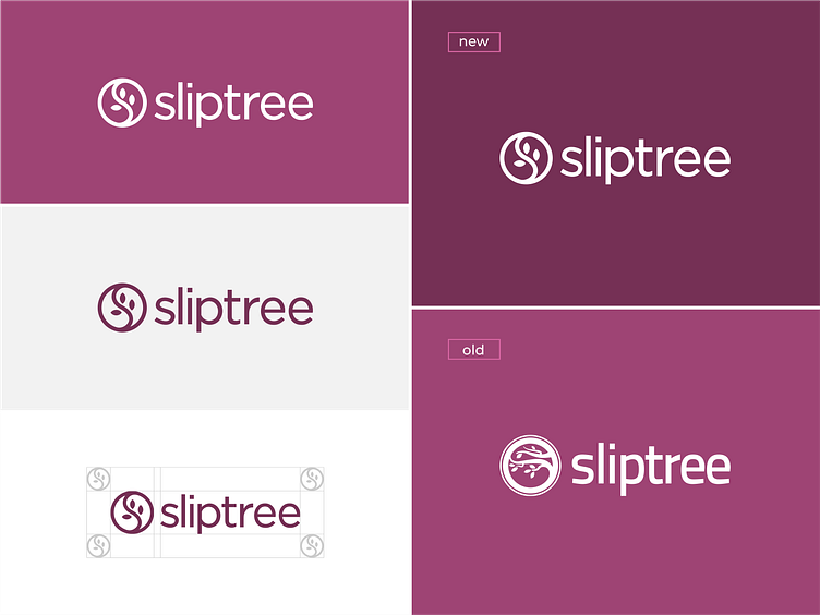
logo redesign for sliptree
so I won a logo contest at 99designs.com
I combined the leaf illustration and the initials S. so that it's easy to understand and easy to use in various media.
BRIEF : Sliptree is a simple online invoicing service (SaaS) used by micropreneuers, small businesses and freelancers across the European Union. We help small businesses get paid on time by providing enterprise-level tools to manage invoices, payments, and expenses.
BRAND NAME & MEANING "Sliptree" is a combination of words "slip" and "tree", where slip can mean a payment slip or invoice and tree refers/symbolizes the software itself (ie a place to create and hold the invoices). The "slip" can also mean a different type of document, such as a price estimate or expense (incoming invoice)
CURRENT LOGO The current logo is somewhat hard to understand, it doesn't work when scaled down to a small size (think browser favicon) and the leaves in the logo seems like an overused concept in our business. These are the issues with it. However, I do like the fact that there is a logotype + logomark, which makes it somewhat responsive
