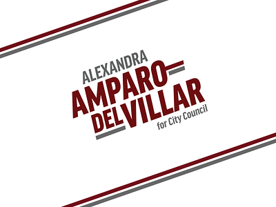
Amparo-Del Villar Campaign
This is a logo I created for a local office seeker. I wanted it to convey some excitement and forward motion. The candidate has a fairly long and hyphenated name, so I wanted to "own" the hyphen and make it key to the identity.
The dual-lines motif comes from some of her legacy collateral. Repurposing that ties in the hyphen further, and also lets her continue to use the old collateral if needed for cost reasons and there still be some cohesiveness there.
The typeface is an italic of her preexisting identity. The left hand side of the "A" is parallel to the collateral edge, which helps it feel grounded on things like palm cards and road signs.
I also created a "short" version with just her initials for uses like buttons and stickers.
More by Mark VDH View profile
Like


