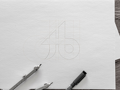
Jack Balke Design Logo
What do you guys think about my new logo? I really did like my first logo, but my first logo was not good for scaling and on top, the "D" for the design was missing.
I appreciate any thoughts and comments below my friends!
More by Jack Balke View profile
Like


