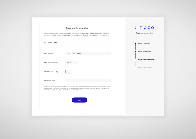
Payment Form with Vertical Progress Bar
This is a design created for a web application - I've changed the branding elements and used an imaginary company name to protect client confidentiality.
I chose to incorporate a vertical progress indicator as opposed to the more traditional horizontal approach because: 1) The sections in this form are dynamic based on country, and in some instances, there may be up to 8 steps. Therefore, it was good to make this scalable. 2) Featuring it on the right side makes it secondary in the natural order of things and act as more of a reference than if it were featured on the left or center.
Please let me know what you think!
More by Grace G. View profile
Like
