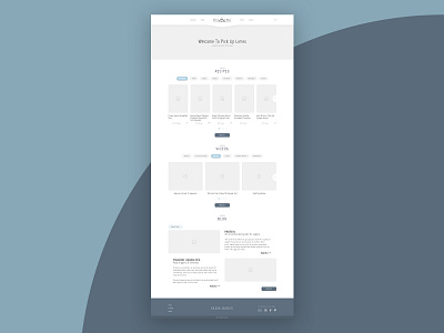
Cooking & Wellness Home Page - Wire frame
Hi there!
This is my very first wireframe for a re-design of a website that I'm working on for one of my favourite vegan cooking channels on YouTube. Pick Up Limes is focussed on producing high-quality cooking and nutrition tips for a healthy lifestyle. Her videos are very clean, structured and organized. I tried to bring that back into the design for her website.
I use her recipes myself and I noticed that she has a lot of (amazing) information on her website. I figured it could use an upgrade to improve the user experience. The user should be able to find the recipes quicker by prioritizing the important information on her homepage which will also make it easier for the user to make decisions.
Please help me to improve my design by giving me some constructive criticism, I am trying to learn more about UI and User Experience.
