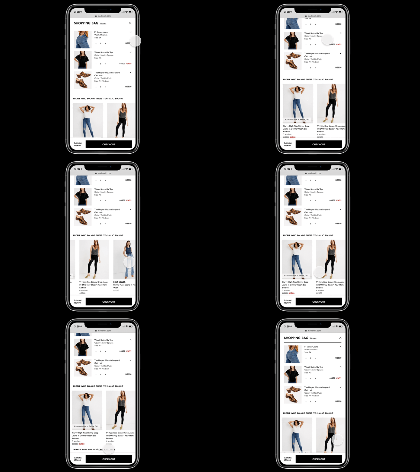
Upsell in Checkout Flow for Madewell.com
Hi everyone! 👋
Here’s a shot of a take-home design exercise back in February from a company I was really excited about and interviewing for. They asked me to take an e-commerce mobile site that had missed opportunities and redesign a key problem area in a few hours. I choose to improve Madewell.com’s checkout flow to give the company the opportunity to cross sell.
E-commerce is something new for me so I started by identifying common e-commerce patterns to evaluate the pros, cons, and why they were used. Madewell expanded what they sold significantly and store associates often pointed customers to the website when the store didn’t carry something. At the time, the mobile website at that time was 1:1 with the desktop site.
Madewell.com wasn’t doing a good job at cross selling (reference their existing flow here) and this was a huge opportunity to make some improvements. This could increase the order size, which would lead to purchase price increase and optimize operational costs. Here's the approach I went with.
