Público web style-guide: Type testing with @font-face
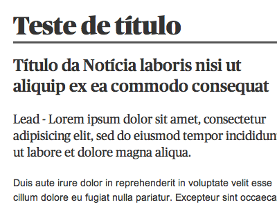
This is part of the new web style-guide I'm developing at Jornal Público, along with the print-version Creative Director to make sure they have a relation. This screenshot is of an already implemented html file, using @font-face to display the "Público Typeface". The biggest news here is the shift from a 12px to 14px text font-size, and a substantial increase in line-height.
The focus of this shot is on typography fonts, size and line-height. I did not think of the best shade of gray for readability - it's just black text on white background.
FIY:
h1 { font: 36px/42px 'PublicoBannerBlack'; }
h2 { font: 24px/30px 'PublicoMedium'; }
p.lead { font: 18px/24px 'PublicoRoman'; }
p { font: 14px/21px Arial; }
Let me know what your thoughts are. Help me, with your precious feedback, shape the future of http://publico.pt ;)
