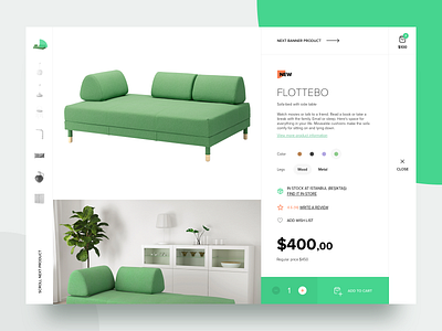
Furnly - Homepage Banner (Detail)
Hi folks!
Want to share you another shot of the Furnly.
Looking at multiple products on furniture web pages has always been annoying. In this design, I tried to find a way out it. After selecting a product, you can change the products in the banner by merely scrolling, and you can read the details or even add them to your cart.
Checkout animated version .
Please leave the comment with your opinion. Hope you like it!
—
Stay tuned and follow us for further updates.
@Wlitz
—
The team is available for new projects and connect with us for hire: hi@wlitz.com
More by WLITZ / Design Studio View profile
Like


