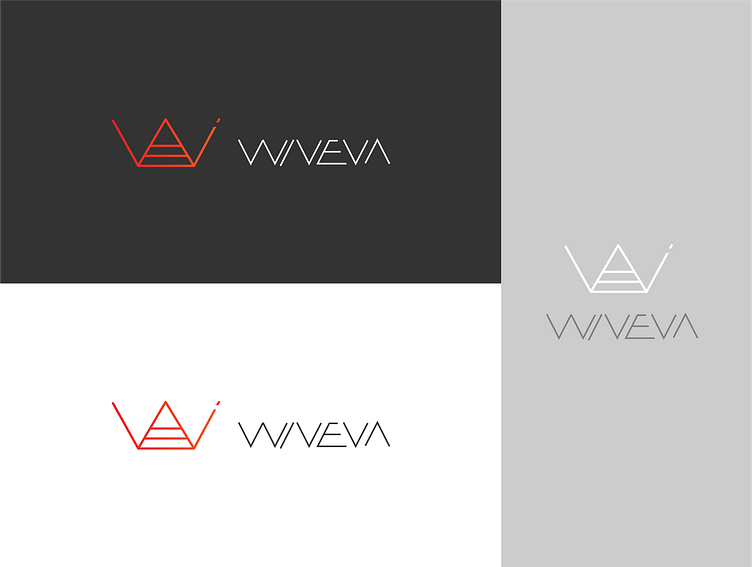
WIVEVA logo
A different take on the same concept as the VVW logo. This time I took the first two letters from each name and ended up with the rather catchy sounding "WIVEVA" name. The logo itself is an intertwining of all the letters present in the name. The dominating shape is the "W" but at the same time this also represents the two "V"'s of the name. The letters "E" and "A" are fused together and the "I" is present in the upper right corner of the "W".
More by Roel Van Eyken View profile
Like

