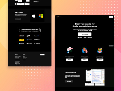
Landing Page - Retest
The requirement for this project was very specific. The whole layout was to be designed in a black background. I included a few pop colors to focus on important aspects of the product; especially the customers part.
More by Pulkit Madan View profile
Like
