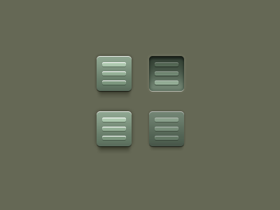
Navigation Pressed State (Critiques Please)
This isn't part of an actual "in production" project but just something I have been experimenting with for a potential upcoming interface design.
I have been struggling with the "pressed state" of buttons in interfaces. I don't want to get overly realistic but I do want the pressed state to be different enough from the regular state that the user will know at a glance whether it is pressed.
So, I need critiques: the button on the left is the "regular" state of the button (in both rows) and the second is, obviously, the "pressed" state.
Is the top version too much? Is the bottom version too little or closer to being more usable?
More by Todd Coleman View profile
Like
