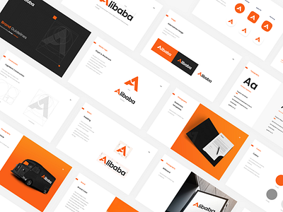
Alibaba Logo Redesign Concept
Recently, I was researching on Alibaba Group and found something to work on! This is the Redesign concept of branding guidelines of the Alibaba Group! :D
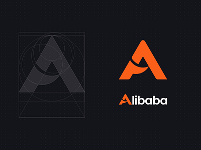
The Main logo, I made with the golden circles, it took a lot of drafts to reach out the perfect figure. I was trying to represent a smiley face through the letter 'A' means that customer satisfaction also if you closely notice there is an arrow-like symbol at the bottom left of the letter 'A' means the growth/prosperity of Alibaba.
And for the wordmark of the logo, the main 'A' letter is 17px larger than the other letters 'libaba'. The main vision of following this scale because "Jack Ma and his team of 17 friends and students founded Alibaba".