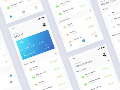
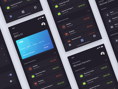
New Finance App - Light Mode Exploration
Hello there!
Back in march I've made a finance application so I figured I should have make it better so this is my take to make it better in my opinion. this is the light version of it.
The main point of this design concept is that so user can see their latest transactions while also see the list of income and outcome of their credit cards.
I'm also currently trying out this layout for the shots, probably wont keep it this way though.
---------------------
I'd be happy to hear feedback from you! :)
Don't forget to press 'L' if you like it.
Follow me if you like my work! More to come.
More by Farhan Ardianto View profile
Like

