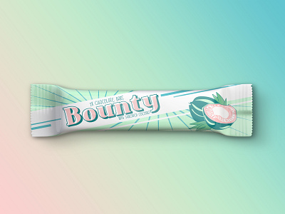
Weekly Warm-up #3 - Bounty Candy Bar Vintage Redesign
Ah, another weekly warm up is here, and the theme is sweet (yes, pun intended). Being a vivid coco lover, as soon as I read favourite chocolate candy, my mind jumped at Bounty, with its tasty shredded coconut core drenched in chocolate. Yum!
However, as much as I love the candy, I've always been baffled by the packaging. The too bright green and blue clashing together, photo realistic illustrations, and the somewhat Tiki inspired font, just don't do it for me.
That's why I did a 180, and made a happy little retro / vintage inspired design! I mixed and combined the original blue and green into this aqua/green mesh (with added spots of coral for contrast and to keep the beach / exotic island theme alive), left the palm trees in the past, and instead made a small custom vintage inspired coconut drawing. All in all, I'm pretty happy with the result!
What do you think? Do you prefer the original, or are you also retro fans? 🥥🍫🏝️

