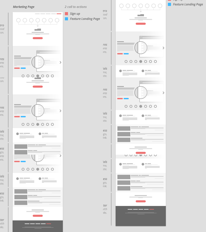
Blueprint / Wireframe
I know I am a horrible at wireframing. I have been told 1,000,000,000,000 to "Get a pencil and piece of paper and sketch something out. It's easier and faster. blah...blah...blah...".
I find that this is one of the most important parts of a design and I just can't wrap my head around why this deserves less finess.
So, I came up with this. It solves all of my problems. I call it a "Blueprint". It's goal is to convey layout and organization of information. I didn't want to have the client distracted with headlines, copy, images, colors, textures, etc. It's small enough it takes almost no time to do and pretty enough to make the OCD side of me happy.
I am also trying something else that I recently fell in love with. It goes perfectly with the small, black & white blueprints; I call it the "Primary call to actions overlay". This allows me to clearly see where I am trying to funnel my users, the spacing of the many call to actions and make sure there aren't too many competing call to actions on a single screen.
On the left are brief descriptions of the separate sections and their purpose.
Please let me know what you think!?
