Daily UI #042 - To-Do List
Thoughts I am a tried and true list maker to keep me organized, and I have tried many to-do lists in the past. However, many applications tend to be too overwhelming for me and I prefer the simplest experience possible. For that reason, I always end up defaulting to the OG reminder app on the iPhone. It’s not the slickest piece of UI design, but in my opinion, the UX is perfect. You enter a task to do and when you are done you check it off, simple.
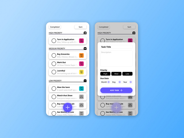
This shot is my attempt at spicing up the reminder app UI and including a couple of modifications here and there.
Design Notes Screen 1 Each task would be a card providing the app with modular and responsive flexibility. The User can sort the cards by Due Date, Priority Level, Title, or they can view all tasks that have been completed.
Screen 2 This screen shows a mockup of what happens with the main CTA [ + button ] is pressed. A modal appears and the User can enter the details of the new task. Selecting the priority level would act as a toggle and only one option could be selected at a time. Pictured here is the default state of the modal before any fields are completed.
-- -- --
Press L if you like my shot, and follow me if you want to keep track of my progress on the Daily Challenges! See you at 100. 😋👍
The challenge is to complete one unique User Interface design task every day, for 100 business days. You can read more about it here: https://www.dailyui.co/
