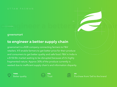
greensmart: logo and brand identity
Hey Dribbblers! ✌️
Today we(me and my cat) would like to show you the logo design of greensmart we have been working on for several days.
greensmart: to fill the gap between farmers and buyers
greensmart is a B2B company connecting farmers to retailers. It’ll enable farmers to get a better price for their produce and consumers to get better quality and safe food. Approx 30% of the product currently is wasted due to inefficient supply chain’s and information disparity, our goal is to create a better efficient system.
process:
We incorporated their values in brand development— trust, connectivity, safe. Design of their's brand identity created towards two major focus groups which are intertwined to create a greater eco-system of the food supply chain - farmers and retailers. Two colorful structures collaboratively show this complex relationship translated through the structure of a leaf.
tools:
Sketch, Adobe Photoshop, Adobe Illustrator, Milanote (nice tool to collab and create boards)
We developed a brand identity and materials to invoke the system with a new voice greensmart, and reflecting the exceptional work they do.
Hit "L" If you like it. ❤️
Soon more!
You do not know where to start?
Share your vision at email: uttampaswan@live.com
Enjoy and have a nice day! 🚀
------------------------------------------


