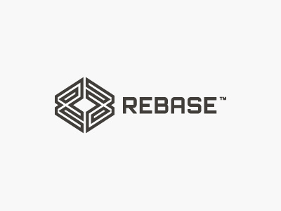
REBASE Logo Update V3
This is an overall tightening up of the actual logo design idea which the client has now approved, so now we are just looking at smaller design tweaks to see what works best.
In this example I have added keylines to the logomark which I actually feels makes it look considerably more interesting to look at (look at attachments for side-by-side comparison as well as logomark in colour). It still retains that 'once you see the RB, then you really do see it' aspect.
The inclusion of this 'maze' style design may not have that initial simplicity, easy on the eye, as the solid logomark, but I feel that this provides REBASE with a much more distinctive and unique mark which has been the overall aim of this game.
This is a lot about creating a logomark that stands out, and holds it own, in a crowded IT crowd. We want to add some 'respectable, bit not cheesy trendy, zing' to an otherwise crowded room of IT based brands.
I have lengthened the height logomark so that it better fills a regular square which also makes the mark a little more prominent (see attachments for various height options).
For this revision I have used a new base font which has then been also tweaked. The flatter tip of the capital A in this font style works much better than the regular 'convergence of two angled lines to a tip style' as now helps glue the letters together and feels more solid and compact.
We havn't dismissed the funky rendering for the app icon versions of the logomark, as shown in the previous Shot. If we do apply funky rendering then it will be just for the actual app icons, but NOT the corporate brand mark.


