App UI Design - TravelAid v.2
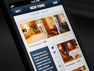
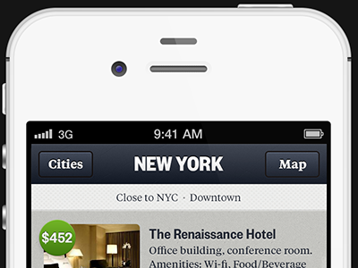
Here is a cleaner and simplified approach to show the listings on the TravelAid app. On this one, you'd swipe left to see more pics on each listing. Swipe right to see a short description + amenities. If there are more than 5 amenities you could swipe up and down. Click here for real pixels.
----
Thanks to @Philip Clark @David Kovalev @nick sloggett @jordan borth @lukas oppermann for all your feedback / ideas on the previous version.
----
Let me know what you think!
More by UI8 View profile
Like

