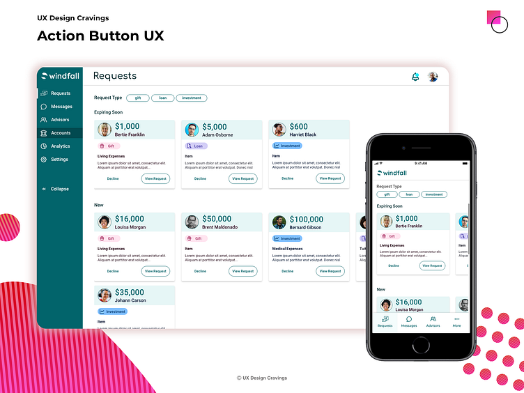
Action Button UX
It is important that the actions you giver your user both are easy to understand, and set them up for success.
View request is the primary action, which allows the user to view the full details of the request and to approve the request if they desire.
Decline is the secondary action. We chose this instead of approve since a user would be less likely to automatically approve a request for funds than automatically decline.
Credits In collaboration with Philip Sams https://dribbble.com/PhilipSams Icons: Unicons https://iconscout.com/unicons
More by Carri Craver View profile
Like
