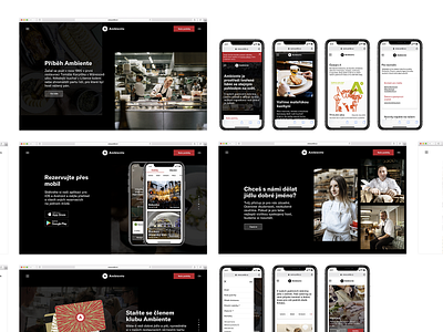
Ambiente – black pages
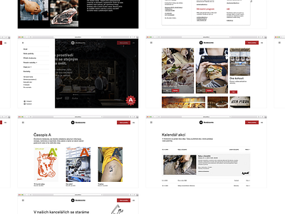
Better overview of all the white pages that I designed for the newest Ambiente website.
The whole website is divided into two sections: black presentational and white for more informative pages, where the first-mentioned acts as a more elegant and subtle introduction to the whole restaurant group.
Check the website live here www.ambi.cz www.najbrt.cz
–––––
Client: Ambiente Art director: Bohumil Vašák Author: Michael Dolejš Cooperation: manGoweb (development & consultation) Font: GT America
–––
More by Michael Dolejš View profile
Like


