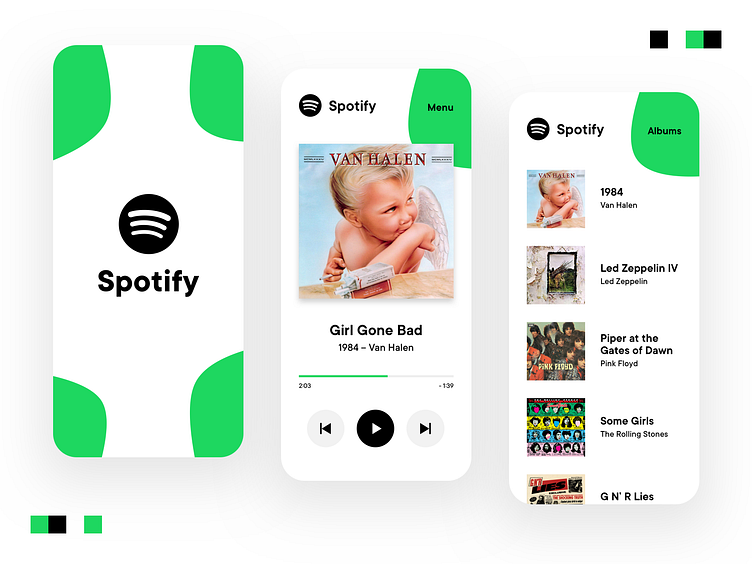
Spotify – New Concept
Here's an app concept for Spotify. I don't use Spotify, but for some reason the app is on my phone, probably from a long time ago. So I opened it up, checked out the UI, and got some inspiration for a Dribbble post – and here it is!
Spotify is pretty simple, and my goal here was to make it simpler. I wanted to go with high contrast and incorporate their brand-green in some other way than just making some text and boxes green.
Please leave feedback – hate it, love it, whatever. Let me know in the comments!
More by Kyle Collins View profile
Like
