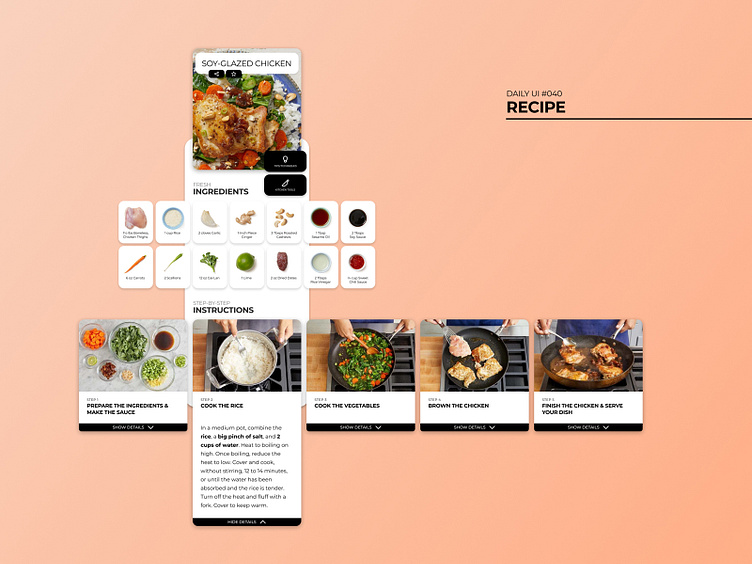
Daily UI #040 - Recipe
Thoughts For this challenge, I used Blue Apron as a content and research reference point. I have used their product in the past, and I was genuinely impressed by my satisfying user experience. They also have great imagery that is perfect to work with while mocking up UI components.
This shot shows the UI components for a recipe website expanded past the frame of a mobile device, in this case, an iPhone X. The ingredients and instructions blocks would scroll to the left and right with simple swiping gestures. Also, the “tips” and “tools” buttons would persistently lock to the top right of the screen, so the user can quickly access these buttons. These buttons would open a modal and include either videos, images, and links to help the user when they need assistance.
One thing I would like to call attention to is the new knife icon I created that compliments my go-to icon pack, Evericons. Although it is very simple and subtle, I think it is an extra touch that ties the whole experience together.
-- -- --
Press L if you like my shot, and follow me if you want to keep track of my progress on the Daily Challenges! See you at 100. 😋👍
The challenge is to complete one unique User Interface design task every day, for 100 business days. You can read more about it here: https://www.dailyui.co/
